Tips for improving your Floral Website design
Revamp your floral website with clean design, consistent colors, simplified navigation, local imagery, Instagram integration, and compelling call-to-actions.
Floral Business
BoostFloral | May 27th, 2024
Your Floral website is an important source of business revenue, and it should be treated with as much attention as your physical store. You wouldn’t have sloppy displays, or unorganized shelves in your physical store, and your online store shouldn’t be any different.
If your website has a bland, outdated, or simplistic design, it may be giving visitors a negative impression of your products or services, and they may not feel comfortable purchasing from your site. It’s important that visitors are impressed with what they see, and that the website provides them with a sense of trust and comfort, that they can safely purchase from the site, and that if they do, they will be happy with the outcome.
With this in mind, lets look at a few things you can do to impress your website visitors and convert more of them to buyers
The first thing to know, is that you don’t have to spend a lot of money to have a professional looking website. Choose a layout that is clean and uncluttered, with plenty of white space to highlight your products and avoid overwhelming visitors.
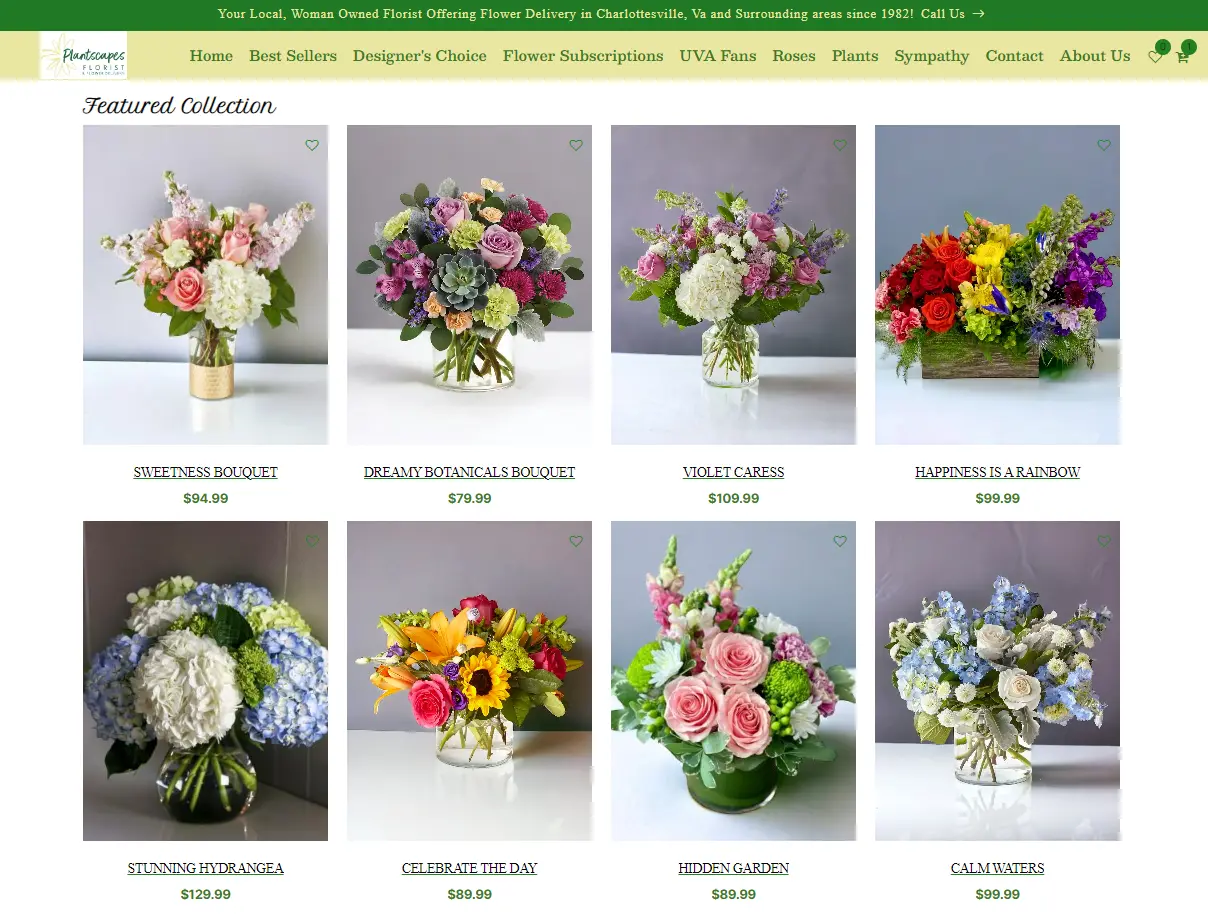
In this example, Notice the use of high-quality product images, good spacing, and clearly defined sections that visitors may be interested in. Another great aspect is the use of different images for variations. When reviewing site traffic heatmaps, the variation buttons are almost always the most clicked item on a page, because visitors want to see the different options.
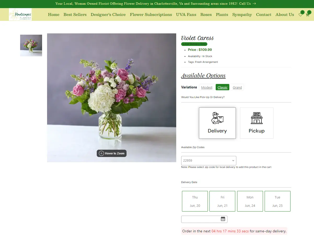
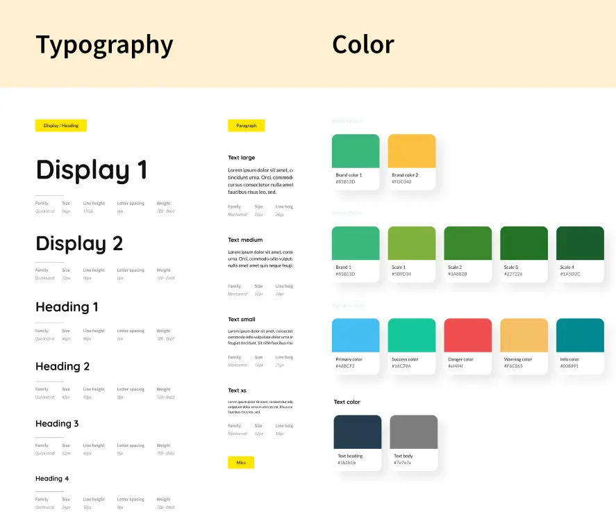
Another important aspect is applying consistent use of typography and colors throughout your site. This is essential for creating a cohesive and user-friendly website that enhances the user experience.
Having a design system to codify the options is a great practice.
These systems help ensure consistency with your brand, and the website builder can help apply the system correctly to your website.
Next. Simplify navigation so you can guide visitors to what they are most likely interested in. Having unnecessary navigation options detracts from the user experience. For example, having navigation options for all seasons and/or holidays all year round. Visitors are probably not looking for Fall arrangements during Spring, hide these irrelevant menus. If a visitor doesn’t find something that interests them within the first 2-3 clicks, they will most likely leave the site.
After improving the layout and design of your site, it’s also helpful to emphasize your local connection with site visitors.
Imagery can be your best friend. Include pictures of your storefront, your team, your events, and happy customers throughout your site, and not just on a Gallery page.
This will remind visitors that you’re a real company, with real people, and it will help visitors get to know and trust you.
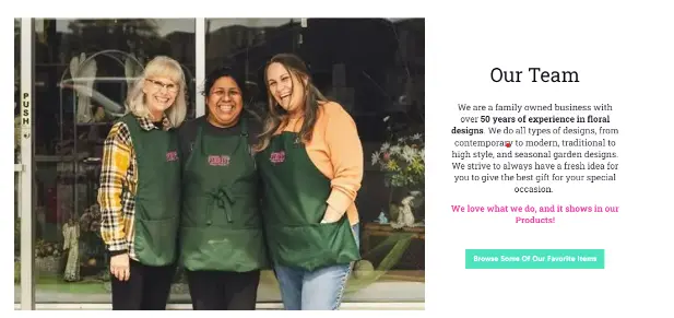
In general, most people prefer to Shop Locally, and 57% indicate that they would even pay more, but there is also a perception that big businesses are more professional and reliable, or may offer better service than small local businesses.
This is important to keep in mind when building and updating your website. Not only do you need to get people to your site, but those visitors need to feel confident in purchasing from your site, compared to other sites they may Shop Around at. (window shopping is very easy online, and having a Better-looking website adds credibility).
Another great approach is adding your Instagram feed to your website. Adding this integration provides dynamic content to your website which can boost engagement, and increase both social media and website traffic.
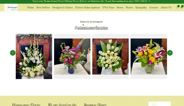
Position the feed where it’s highly visible but doesn’t overpower the main content, such as in the footer or a dedicated section on the homepage. Displaying photos of customers with your products or reposts of their content can provide authentic social proof and inspire confidence with potential buyers.
The last item I’ll touch on is the use of call to actions.
Remember to use Compelling Language in your Call to Actions: Try using clear and action-oriented language that encourages urgency (e.g., "Shop Now," "Order Today").
The placement is also important. Product pages should have prominent "Add to Cart," "Buy Now," and "Send as Gift" buttons clearly displayed.
Special Offers are another eye-catching call to action that you may want visitors to choose. Highlight special offers, discounts, and promotions with eye-catching banners and buttons to that will attract attention.
Summary
There are many other considerations such as adding reviews to your website, streamlining the checkout process, and effective SEO that contribute to a more professional website, but if you follow these tips above, you’ll find that site visitors will be more engaged with your site.

